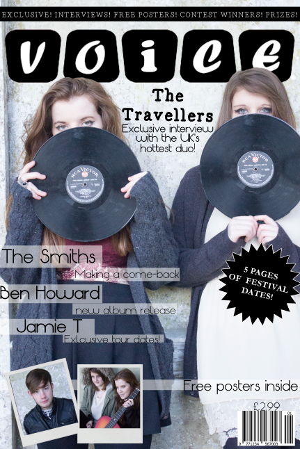
How does your media product represent a particular a social group?

I believe my music magazine represents similar group to the magazines 'NME' and 'Mojo'. And I have used this photo from 'NME' to high light this. Both the 'NME' model and my models are holding the same pose, with the records in front of their faces and only their eyes on show. From knowing the artists music, he is in face under the genre of 'Indie' as well.
In terms of gesture the pictures are very similar as well. Both the images have the same sense of seriousness. The reader can only really tell the readers expression through their eyes as it is the only facial feature showing from behind the record.
As for the angle and shot type of the photos, they are both similar. They both have eye line and on both the eyes are the only feature showing. The lighting is similar as well, both photos are bright but not over exposed.

I tried different features when creating my music magazine and an example of this was what my models looked like. I dressed my models in earthy, stylish clothes. The earthy and pastel colours was so they would match my music genre and colour scheme but I also tried to make the models look different from each other so they would appeal to a wider audience. With the models poses, I tried to make them more casual then posed so they would look friendly, hence why in majority of the photo's the models are either laughing or smiling, this also shows the models as being close.
I think my magazine can represent my chosen social group simply through the general style. There is a earthy and pastel colour scheme, which are colours that can be easily associated with my target audience because their connotations. The connotations of 'Indie' music is the era of hippies, where everyone listened to acoustic and upbeat music.
I researched many other "Indie" magazines when deciding on the colour scheme and camera shots of my magazine. For the front cover, the most popular shot would either a close up or a further away shot but on every cover I looked at the eye contact was always there. So this was my main focus when creating the front cover.
I had to make my models age appropriate to appeal to my audience. In a way, I am my own audience because this magazine would appeal to me and I like the music I am showing, so I made the age audience teens to young adults or anyone that appreciates good music.
Of course, when a consumer is buying a magazine, the front cover is the first thing they will see. So when creating my cover, I tried to make it represent the music genre really clearly, so that it is very apparent to the buyer. Hence the records and the polaroid's .


 This is a photo of Hozier, I like this photo because of the background. I think I could base one of my photos off of this. The photo looks like a ruin of maybe a house or something, which is very similar to where I will be taking my photos for my music magazine, because I am doing it a ruin of a castle. I also like the way his blue denim jacket stands out against the earthy colours within this photo, again something I may use in my photos.


 Font: Autumn font