 Font: Brain Flower
 Font: Please write me a song
Font:Fineliner script

Font: Autumn font

Font: Tall tulips

Font: Milkmoustachio
Font: Brain FlowerFont: Please write me a song


 This is the "Nirvana" logo. This colour scheme is a little different to the rest. The yellow in this logo is meant to represent energy and joy, while the black colour stands for power and supremacy. The smiley face is meant to represent death, and shows a complete stage of happiness. But again, similar to the rest of the logo's it has a black background, making it stand out and eye catching.
 This is the "Paramore" logo. I really like the font of this logo, because it looks like it has been scratched into something. The font makes the writing look it has been written in the air using sparklers. I really like this font because of how different each letter is. Each letter has a different shape and some are even missing lines, I think this makes the logo very memorable.
 This is "The Smiths" logo. This logo is very simplistic, with the dominating colour being black for the text. The text is in a simple row, and they have used a very professional font. All of the font is in capitals as well, creating a sense of power from the logo.
 I am unsure yet what my front cover is going to look like, and it may not look like this at all. But I have a vague idea of what I want it too look like. I obviously want the masthead to be at the top of the page. The light blue box represents where the title is going to be. And the large purple shape in the background represents where the main image of my model is going to be. The main image of my model will have their head slightly over the masthead. This will make it look more interesting and appealing. Also the little purple boxes put at different angles represent other pictures I will be using on my magazine cover. On this diagram I have not put boxes for text but I will also include text on my front cover. There will be a main cover line across the front of the main image, either quoting something the model has said or something to do with her type of music. There will also be other cover lines describing the other, smaller images.
 The light blue box below it represents the slogan I will be putting there, it will be something that will also be included in the interview. Below that there is another light blue box, here I will have an interview between me and my main model, and below that I will have other pictures of that, that will have something to do with the subject of

 This is my preliminary task
 This is the analysis of the survey results. This question was "how old are you?" The most popular result was the age "11-20". This result means that people who are most interested in music are aged "11-20". I put this question in my survey because I wanted to know what age audience I was aiming my music magazine at.


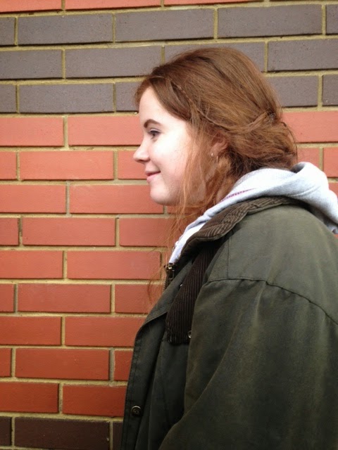
 I am going to be using Hannah Weeks for my preliminary project, because I think she has a school look about her. I think that she will be a good model to work with. Hannah is also very photogenic. I may be also using her for my actual magazine.


 I can also make her hair big because it is so long, this again fits the style of my magazine.


 Charlie would also offer diversity as she has blonde unlike any of my other potential models.
 Charlie also has height as an advantage and is very photogenic.
 I really like this contents page, because its done very differently. I like the way text goes around the artist instead of the other way around. I like how they have used the space that had to make it mostly about the artist but also made the text really clear to read. The different positioning of the model, makes it more interesting and eye catching for the reader. I also really like the colour scheme of this page. The white, bold title stands out on the grey background which also matches the woman's outfit. The black writing of the text also stands out from the background as well.
 This contents page is a little more informative than the previous one. I like the black and white idea for a contents page, because it makes the texts, that are different colours, stand out against it. I also like the idea of having a picture behind the text. They are using the rule of thirds on this contents page. I also like the way, that the text goes across the page when talking about the artist in the background. Although, I would not lay out my contents like this for my own magazine. I like the picture in the background and the colour scheme, but I don't like the way the text is put across the page with the numbers text to them, I prefer the way the text is on the other example of a contents page.


