
Both these double page spreads use one of the pages for a large picture of the music artist. I think this looks very effective because it gives them the focus.
On the page spread featuring "Lady Gaga", the colour scheme is very eye catching and bold. I like the huge "L" in the back ground. I may use this idea in my own music magazine. It adds a different colour to the very plain colour scheme, that without this unique detail, would look boring.
The other double page spread featuring "Alexandra Burke", has again a very plain colour scheme of black and white, but matches nicely with her clothing. Then, the artists name is in a pink. to make it stand out and seem more important.

I don't like the second double page spread at much as the first one with "Lady Gaga"because it I feel it is less effective. And if I was a reader of the magazine, the first double page spread would be more appealing because of the bold colours.
The page featuring "Lady Gaga", is aimed at an older audience than the one featuring "Alexandra Burke" and you can again tell this by the colour scheme. The colour pink, is a girly colour and gives off a "pop" vibe, whereas the colour scheme of the "Lady Gaga" one is bolder and is made to appeal to an older age group, like teenagers and young adults.
The pictures on both these spreads have the artists looking directly at the camera and doing some sort of pose. By putting "Lady Gaga" in a sepia type effect, they have given her an old fashioned feel, where as the "Alexandra Burke" one her clothes are silver and shiny. These again give off a "pop" vibe. The poses on the magazine are both very sexualised even though the one with "Alexandra" Burke on the cover, is aimed at a younger audience. Although the one with "Lady Gaga" on the page is more sexualised than the other, she is pretty much naked, with only a few necklaces on. But I think the "Lady Gaga" one is more sexualised because it is aimed at an older audience as we can tell from the colour scheme. Another thing that shows what age audience the magazine is aimed at in the font used in both texts. The first one with "Lady Gaga" in it uses a more formal font that is straighter and in line whereas the other one with "Alexandra Burke" is more informal, although it is in a grid like the "Lady Gaga" one.
The camera angles on the "Lady Gaga" one is eye level with the audience but "Lady Gaga" is still looking down slightly at the audience. Showing that she is slightly above the reader, making her seem superior to the reader. On the second one with "Alexandra Burke" the camera is a low angle, again making her seem superior.

These two double page spreads are different because they are representing bands instead of just single artists. On the "Paramore" double page spread, the thing that stands out the most in the colour scheme, with a beige type background and black writing. The orange colour is very cleverly used on the spread, because its a direct match with the lead singers colour hair. This adds an element of interest to the page. I also like the style of text they have used for the title. It has a "rock" feel to it, with all the disconnected letters going all the way across the page.

Again, both of these spreads use the artists as the main focus and keep and entire page dedicated to a photo of them. I think this is the most popular way to do the magazine spread.
The second double page spread of the band "Nirvana" is also very well done. The way they have positioned the band is cleverly done, so it looks like a friendly photo and not a photo-shot photo. The main singer adds to this vibe by pulling a funny face instead of posing. I think this double page spread is very unique to the band. The colour scheme generally consists of blue, white and black. But there is an orange text box on the side of the page. This makes it seem more important than the rest of the writing around it. The camera angles in the first double page spread with "Paramore" on the front, the camera angle is lower to the readers eye line, making them seem higher up the page and more superior. The women seem more important and the leader of this group, as she is front of the two men. Although all the models have very causal poses.
In the second magazine cover with "Nirvana" on the front, the camera angles are directly on the readers eye line. So it makes the reader feel like the band members are looking directly at them. Also all the men are very close together compared to the other "Paramore" double page spread. This gives the picture a sense of closeness.


 This is the analysis of the survey results. This question was "how old are you?" The most popular result was the age "11-20". This result means that people who are most interested in music are aged "11-20". I put this question in my survey because I wanted to know what age audience I was aiming my music magazine at.


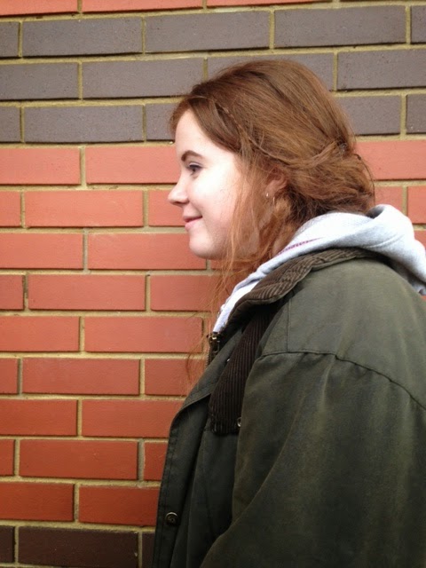
 I am going to be using Hannah Weeks for my preliminary project, because I think she has a school look about her. I think that she will be a good model to work with. Hannah is also very photogenic. I may be also using her for my actual magazine.


 I can also make her hair big because it is so long, this again fits the style of my magazine.


 Charlie would also offer diversity as she has blonde unlike any of my other potential models.
 Charlie also has height as an advantage and is very photogenic.
 I really like this contents page, because its done very differently. I like the way text goes around the artist instead of the other way around. I like how they have used the space that had to make it mostly about the artist but also made the text really clear to read. The different positioning of the model, makes it more interesting and eye catching for the reader. I also really like the colour scheme of this page. The white, bold title stands out on the grey background which also matches the woman's outfit. The black writing of the text also stands out from the background as well.
 This contents page is a little more informative than the previous one. I like the black and white idea for a contents page, because it makes the texts, that are different colours, stand out against it. I also like the idea of having a picture behind the text. They are using the rule of thirds on this contents page. I also like the way, that the text goes across the page when talking about the artist in the background. Although, I would not lay out my contents like this for my own magazine. I like the picture in the background and the colour scheme, but I don't like the way the text is put across the page with the numbers text to them, I prefer the way the text is on the other example of a contents page.
 These two double page spreads are different because they are representing bands instead of just single artists. On the "Paramore" double page spread, the thing that stands out the most in the colour scheme, with a beige type background and black writing. The orange colour is very cleverly used on the spread, because its a direct match with the lead singers colour hair. This adds an element of interest to the page. I also like the style of text they have used for the title. It has a "rock" feel to it, with all the disconnected letters going all the way across the page.

 On the both the covers, I think they use colour to their advantage, like in the first one, they use yellow of her hair and this makes the magazine stand out. Also on the"paper" magazine, the blue background really catches my eye. I feel this colour is really hard to use well, because it is so bright and many colours clash with it, but on this magazine it works really well. Both the covers use the rule of thirds, where the models eyes are on the top portion of the magazine.
 In these magazines, the cover uses bold titles, and unlike the other ones, they have a lot of writing on the front of the covers. They have a lot of advertising on the front, showing buyers whats on the inside of the magazine. But like the other two magazines, they again use colour to their advantage. The magazine, "Mojo", has the cover, with the dominant colour of red. This again makes the magazine eye catching. It also suites the singer on the cover. The artist on the cover is "Kurt Cobain", who is known for being a grunge singer. The colour red, makes the magazine very personal to the singer that is inside.
 These magazines are both of bands rather than just one person. On "guide", the band are very close to each other, so they are still obeying the rule of thirds. The colour scheme is a very basic grey background. But it has a white title, on the grey background making it stand out. Also the writing of the bands name is in dark red,again making it stand out and is eye catching. This cover has very little on the front, making it very focused on the band.
 On the "NME" magazine, it is of a group again, but they are very differently positioned. They have more of casual, "caught off guard" position. It has an even more simple colour scheme than "guide". The "NME" colour scheme consists of black and white and red. The red makes the title stand out and the black and white photo suites the band. The reader is given the impression that all the important bits of the magazine are written in red, including the bands name and the title of the magazine.
